With 57% of eBay transactions being touched by mobile, making your eBay template responsive for mobile is a crucial strategy to win sales.
This post will cover the best practices, the do’s and don’ts of creating an optimal mobile shopping experience for your eBay shoppers with eBay responsive template.
Best practices to create eBay responsive template listings
So, how can you ensure that your eBay listings are optimized for mobile?
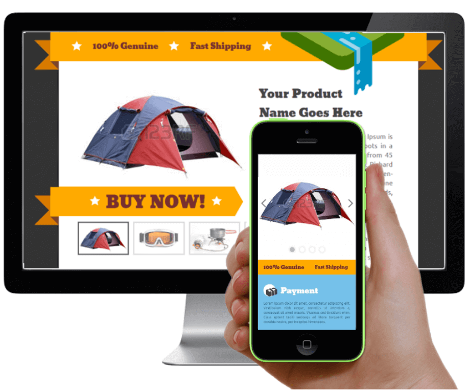
A responsive ebay template
Make your listings responsive
First things first, before I discuss the various listing elements and how to best optimize them for a smooth mobile shopping experience – You need to make sure your eBay listings are responsive, meaning they will automatically adjust for mobile devices.
What is a responsive eBay listing?
A responsive eBay listing makes your listing look good on all devices (desktops, tablets and phones).
Responsive listings are about using CSS and HTML to resize, hide, shrink, enlarge, or move the content to make it look good on any screen.
Note that because an eBay listing looks different on a desktop and on a mobile device, your listing should be able to automatically adjust to the screen size it’s being viewed on – that’s a responsive eBay listing.
How to make your eBay listings responsive?
Option 1: Use HTML and CSS
For sellers who are code savvy –
From eBay – eBay recommends using HTML and CSS to detect browser/device type in order to customize design/layout. Below is one example of how HTML and CSS code can be used to control column width and behavior based on browser/device type. This HTML and CSS is input into the item description.
Click here for the eBay code example
Option 2: Using CrazyLister
For sellers who are not code savvy –
CrazyLister’s mobile view editor allows you to change design, hide content, scale and move features – while leaving the full-size desktop version of your eBay listing unchanged.
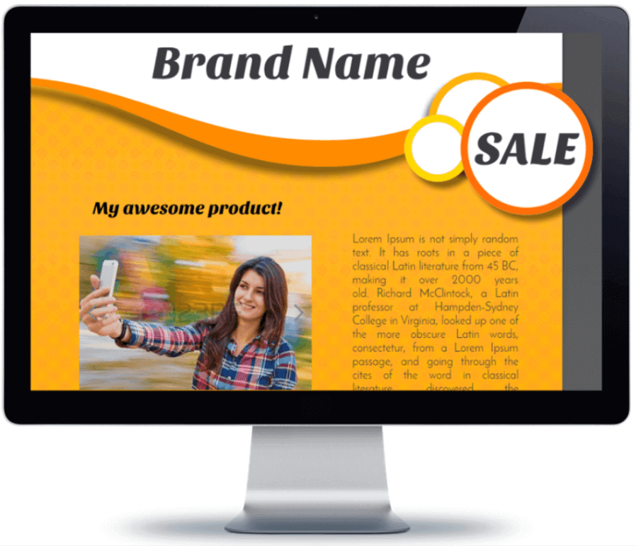
CrazyLister desktop view – ebay responsive template

CrazyLister mobile view – ebay responsive template
Let’s see here is how it works –
- Switch between the desktop and mobile view editors –

CrazyLister mobile view editor to create ebay responsive template
- Adjust your listing features for a smooth mobile experience –
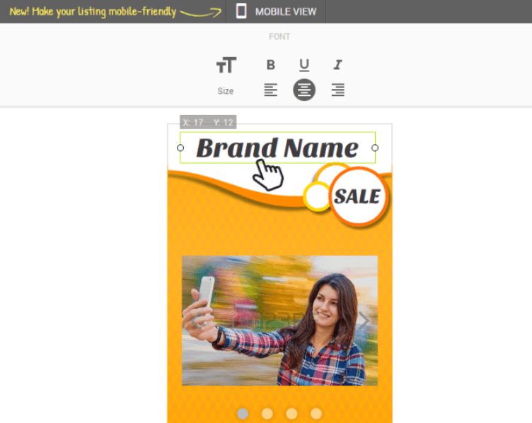
using CrazyLister mobile view editor to create ebay responsive template
- Any changes you make on the mobile editor, will not change the desktop version of your listing.
The HTML code that CrazyLister generates, contains both the desktop and mobile description versions.
It also contains a module that recognizes if the listing is being viewed from a desktop or a mobile device, so whenever the listing is being viewed from a mobile device, the mobile description is the one that’s shown.
The result is eBay responsive template, optimized for both desktop and mobile shoppers.
Now that you understand the concept of an eBay responsive template, we can dive in and discuss the best practices of a mobile optimized eBay listings.
Do’s and don’ts of creating eBay responsive templates
 Do: Keep your mobile description short
As opposed to the desktop version of your listing, the mobile one has a very limited screen “real estate”. You want to make sure only the most critical information is presented there – just enough to push the shopper into making a positive buying decision.
We can learn from Amazon here, they actually force sellers to come up with the 5 most important selling points –
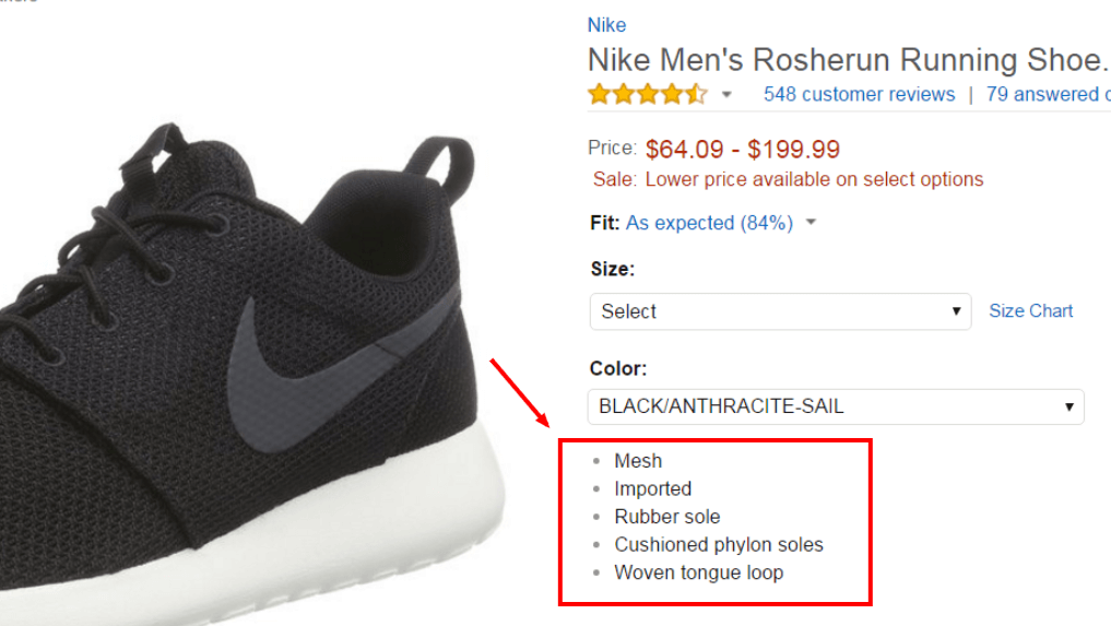
Amazon 5 selling points – short listing description
When a shopper is reading your mobile description, he already knows what your product is, its price, etc. The reason he reads the description is to be convinced that this is indeed the right fit for his needs, and that he’s dealing with a trustworthy seller.
Think about up to 5 of the strongest selling points, and add them to your mobile view listing description –
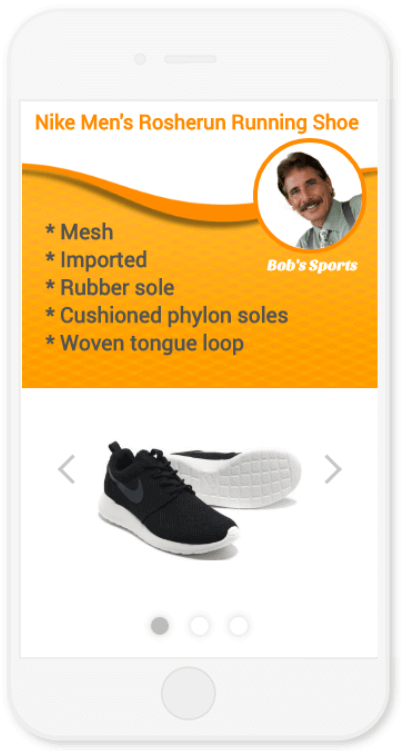
Add up 5 selling points to your mobile eBay listings view
 Don’t: Add walls of text
You have to assume people don’t read long texts, especially on mobile devices. Unless absolutely necessary to describe specific features of your item, keep your mobile description short.
Summarize any important aspects into easy and fast to understand bullet points and visuals.
The beauty of a responsive design is that you can have descriptive texts on your desktop version of the listing, while hiding these texts from the mobile version – to keep it short and effective for mobile shoppers.
Note – Any changes you make on the mobile editor will not change the desktop version of your listing so you can have optimized versions for mobile and desktop.
 Do: Add a memorable element to stand out
According to studies, you have ~8 seconds to grab the shopper’s attention. This means you have to be different, stand out, offer something that your competitors don’t.
In the example above, I added a personal touch – the face of a seller (Bob), greeting the shopper.
Below is another example of a memorable, personal touch to stand out – by Chelsea Frank, a CrazyLister user.

CrazyLister mobile view – add personal touch
It can be any other element to make your listing stand out and memorable, along with keeping the shopper engaged with your description.
Here are some ideas for effective headlines you can add – Elements You Should Check When Your eBay Listing Isn’t Selling – Part 2: Description Headline.
 Don’t: Add widgets
Widgets are – “My other items carousel”, “Feedback widgets”, “Search forms” etc…
Widgets won’t render properly on mobile devices, they take a long time to load and will only make your shoppers pinch and scroll. (And nobody likes to pinch and scroll)
Important: Most of the widgets are using code that is already banned by eBay as part of the eBay active content ban policy.
 Do: Increase font size for the mobile listing version
I’ll let the visuals speak for themselves –
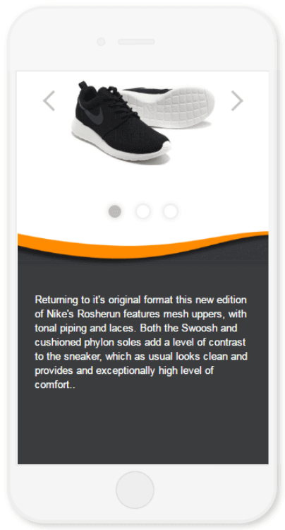
Small text on mobile eBay listings
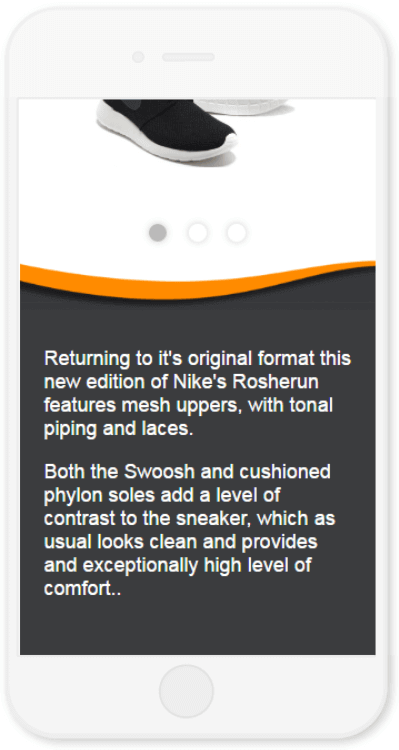
Large text on mobile eBay listings
Make sure you enlarge your text on the mobile version of your listing – so it’s readable without the buyers having to zoom in!
 Don’t: Repeat your polices on the mobile listing version
Unless you have something important (like free worldwide shipping), you want your customer to remember, that can actually make or break a deal – don’t waste the precious screen size on policies that are easily seen via the eBay mobile app.
eBay has a dedicated section for policies in the mobile app –
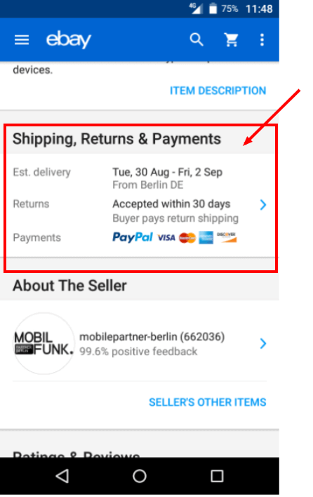
mobile listing policies in the ebay app
 Do: Use tabs for showing critical info
If you have critical information you believe is essential for making a positive buying decision, use tabs to present it in a clean and easy way –

CrazyLister – mobile listing tabs
Whenever a mobile shopper touches any of the tabs titles (e.g. “Why choose us”), the relevant tab will open up – showing the relevant information.
Using tabs ensures your mobile listings stay short and easy to navigate without the user having to scroll through tons of texts to find the necessary info.
 Don’t: Add “heavy” photos
Adding photos with sizes of above 100kb may slow down the listing description loading times.
This is true for both the desktop and mobile versions of your listings. More on that here – Elements You Should Check When Your eBay Listing Isn’t Selling – Part 1: Loading Speed.
At CrazyLister, we automatically resize the images you upload to ensure optimal loading times.
Let’s bring it all together
Here is an eBay responsive template sample I have created –

.jpg)
.png)
.png?versionId=caKn5dGp5uDds2Pu0s1YHvFcvZa1N1x.)
- Full mesh upper for excellent breathability
- Full-length IU midsole for lightweight cushioning
- Solarsoft sockliner for premium comfort
Support a local faimily business!
We are cute 🙂
We will not rest until you are 110% satisfied!
.png?versionId=VEpxrKBtwxq4Vjc7yPhBtZqJBP10LKvY)
Conclusion
- Make sure your eBay listing is RESPONSIVE, showing a desktop version to desktop shoppers and a mobile friendly version for mobile shoppers.
- Adjust your mobile listing description for a fast and easy experience for mobile shoppers – Increase your fonts, consolidate information in tabs, avoid “walls of text” and heavy images.
These best practices are all aimed toward distilling the core essence of your desktop listing to the mobile version.
As a rule of thumb – Keep your listing’s mobile version to the minimal required information and visuals to drive the shopper to a positive buying decision.


