This week you’ll learn how to boost eBay sales with top eBay design tips from Etienne Amion, a professional eBay template designer and a veteran seller. Etienne will be providing awesome eBay design tips for 2020 and beyond!
Throughout 2019, I worked with so many great eBay businesses on some awesome projects. With each new template design we created ever more successful, creative eBay designs that convert to sales.
If you’re reading this post, can I assume that you’re looking for ways to save time on listing and give your eBay sales a boost in 2020?
Then this is the post for you!
I won’t tell you what to do. I’ll show you an example of eBay template design incorporating some top eBay design tips you can use to give your own listing templates that professional look!
How to boost eBay sales – Main topics
- General structure and features
- Making your titles, taglines and call to action stand out
- Adding shadows to create depth
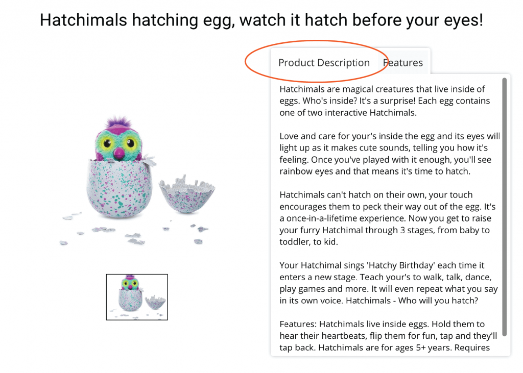
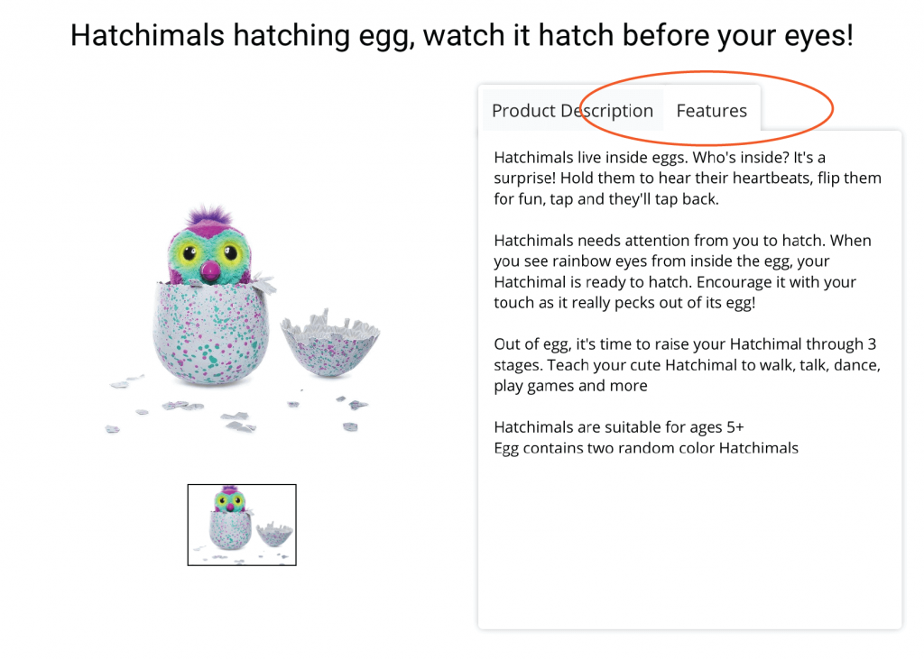
- Creative use of tabs in your description
- Increase cart value with the new cross-sell gallery
1. eBay Design – General structure and features
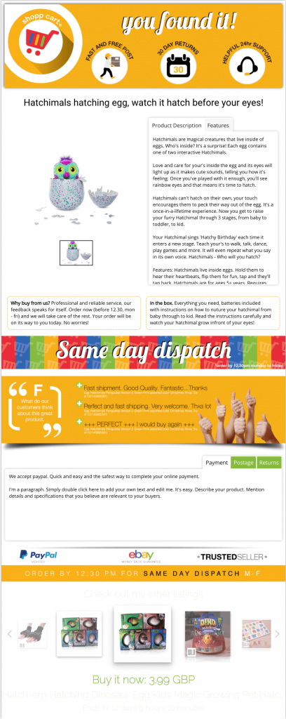
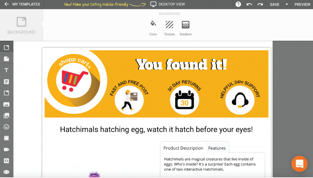
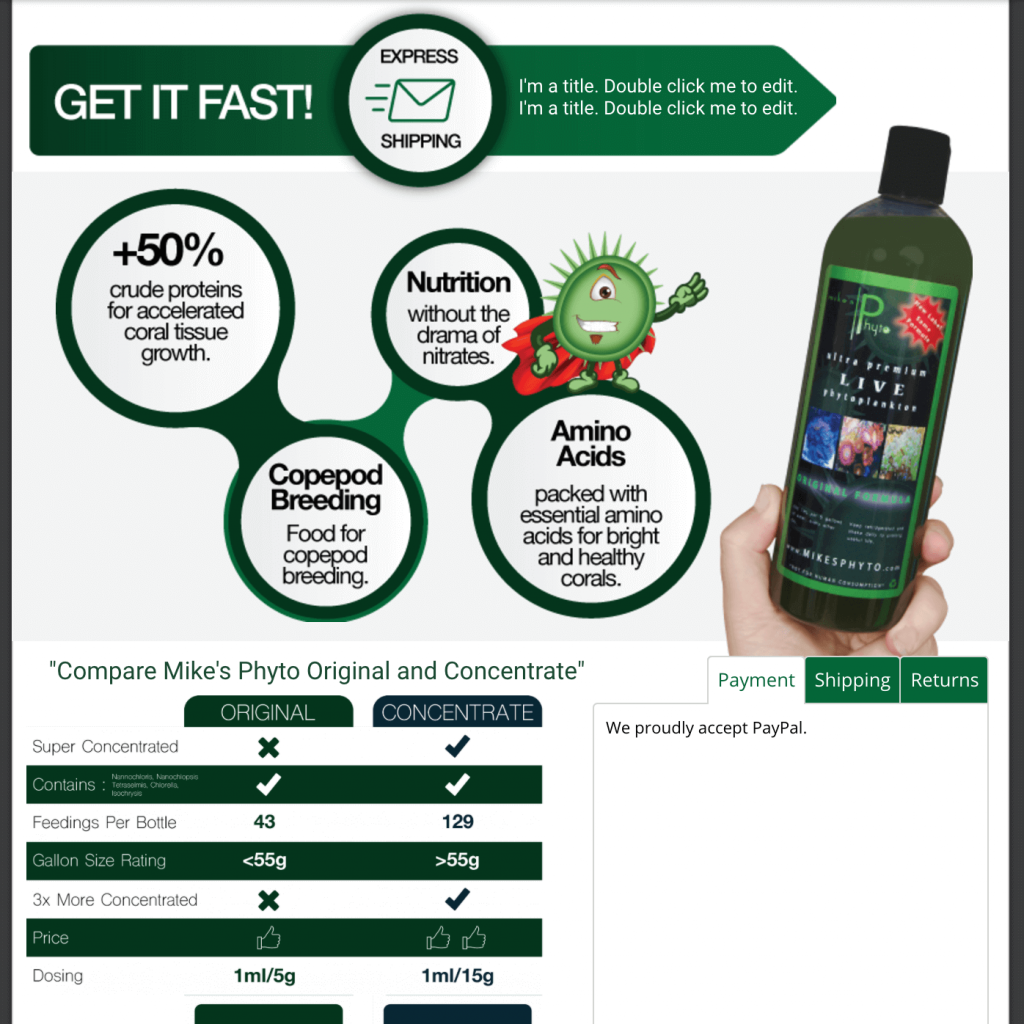
This eBay design template is made up of six main sections, all tailored to communicate a specific message to guide prospective customers towards a sale:
#1: Header
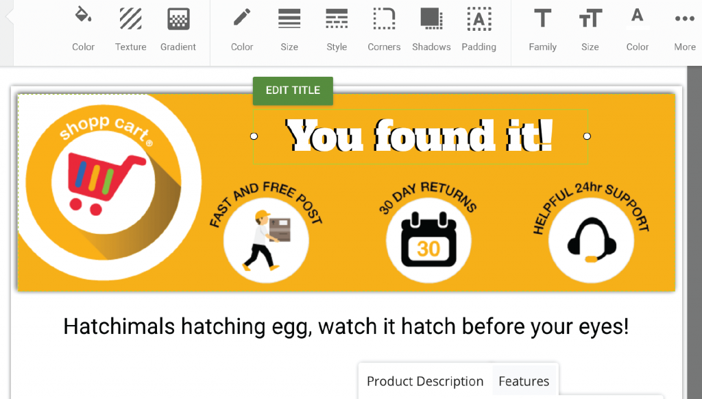
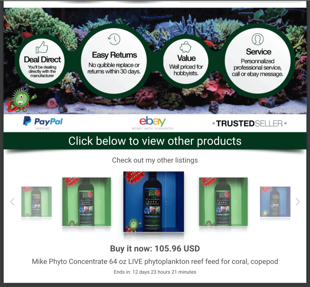
Made up of a professional logo to set the tone for a professional listing, three service icons to reassure customers that when buying from this listing, they can expect fast and free shipping, a healthy returns period in case they change their mind and helpful and attentive customer service for any queries or issue. And finally, a great tag line to inspire confidence and, of course, encourage them to read on.
#2: Image gallery and description
Image gallery alongside a tabbed product description that allows for scrolling regardless of the length of your description, the dimensions and aesthetics of your template design will be maintained.
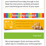
#3: “Same Day Dispatch” Banner
A statement as well as a call to action. After a buyer reads the product description and views the gallery, this banner will be a subtle reminder to ‘buy now’ knowing that they will receive their order quickly.
#4: Feedback banner design
Feedback banner to quickly communicate that existing customers are happy with their purchases. Instilling confidence in the product with genuine honest feedback. Easily put together with text and images.
#5: Policy Tabs
Essential space-saving policy tabs, all the important information without cluttering the design.
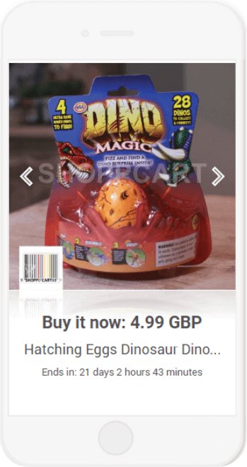
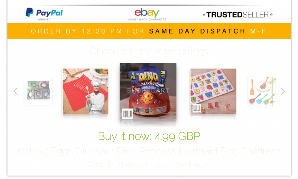
#6: Cross-sell gallery
The all new CrazyLister cross-sell gallery (100% compliant with eBay active content ban and links policy)! Simple and easy to add to your template, an opportunity to showcase alternative products and sell multiple items per transaction.
Did I mention its 100% compliant with eBay’s active content policy…
 |
 |
 |
 |
2. Making your titles, taglines and call to action stand out
Taking a closer look at the header image. It is made up of three components:
- A professional logo. A must, sets the tone for a professional listing.
Contact me if you need help creating an awesome logo for your eBay store. - Key service icons to reassure your prospective customer that shopping with you will be efficient and painless: Fast and free post, 30 days returns, helpful 24h support.
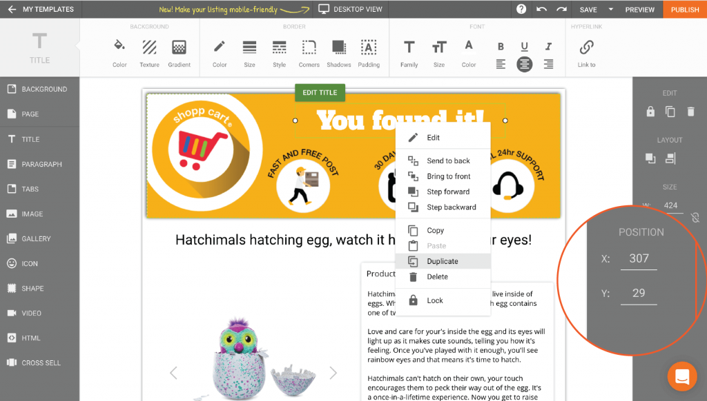
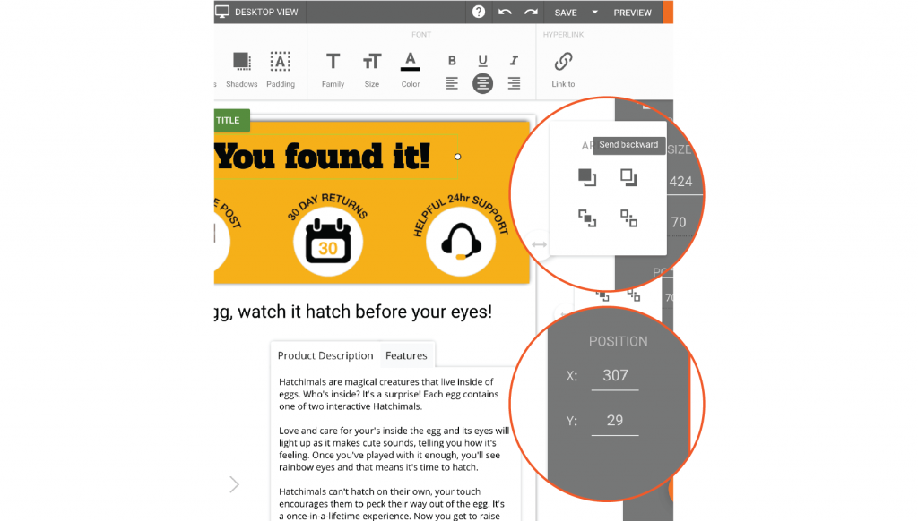
- “You found it!” A strong slogan to remind them that they are in the right place. I’ll show you how to layer your text to make any header text really stand out below!
Try CrazyLister for free! Easily create professional, mobile-optimized eBay listings
3. Adding shadows to create depth
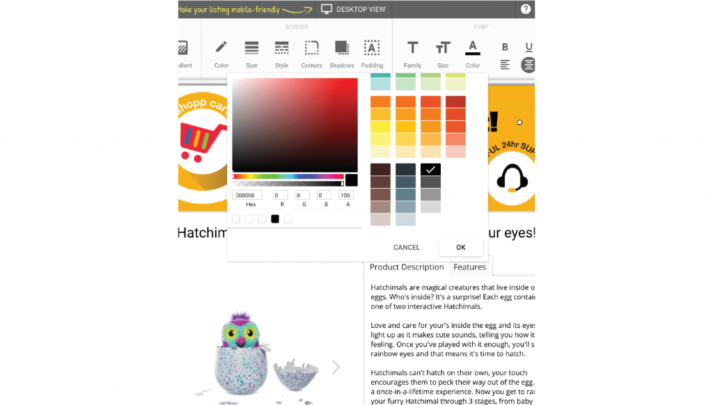
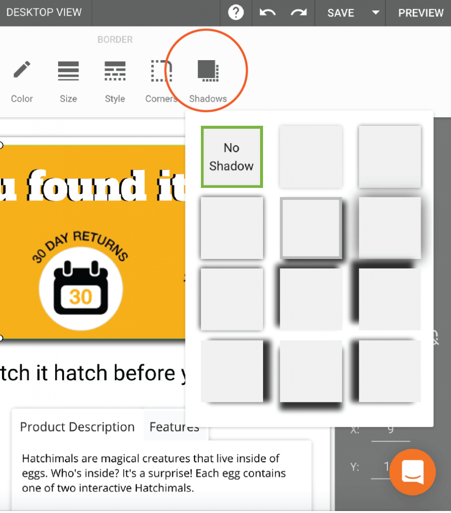
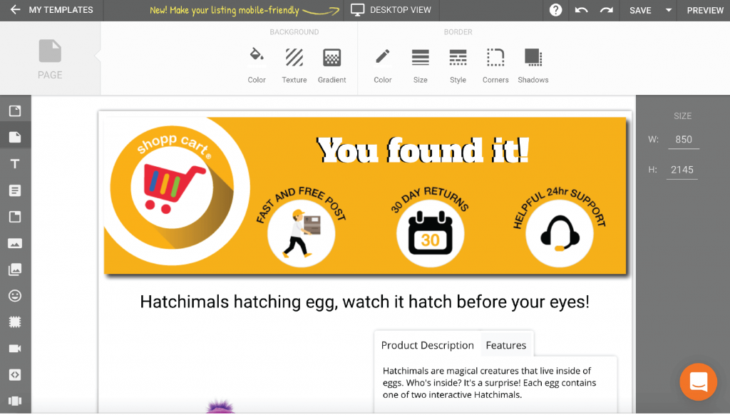
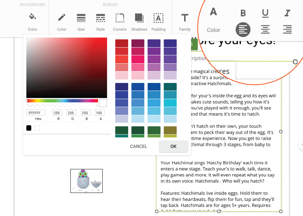
Let’s talk shadows. Easily applied to almost any part in your listing. You can add depth, a three dimensional component to shapes, text and tabs, almost anything. Use the shadow tool to add a subtle aesthetic or to emphasize a particular aspect of your template design. It also helps to break up the listing into different sections without using garish borders. Let’s take a closer look at how a drop shadow has been added to the header image.
4. Creative use of tabs in your description
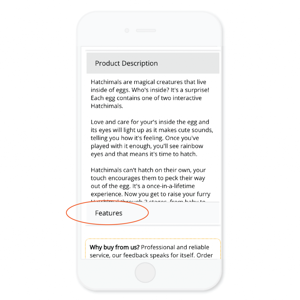
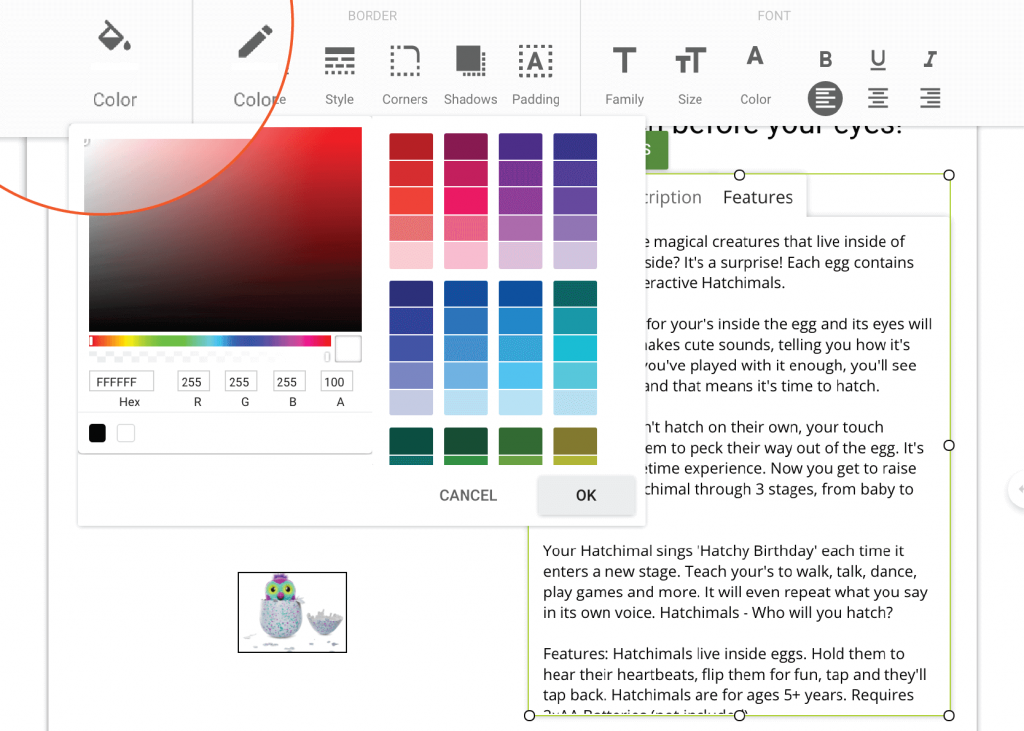
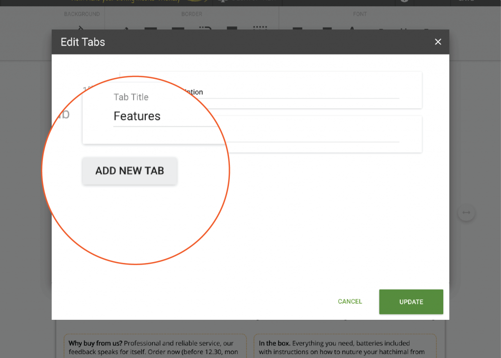
Now let’s talk tabs! I have spoken about tabs in a previous post. They are both practical and save precious space for boring yet essential information such as postage and return policies. Here I’d like to show you how I am also applying them in the product description area of the template now. Let me tell you why I know this is a great idea if your item descriptions are not too long.
A client came to me with a pain point. We had built a great general template he had been using successfully with the majority of his listings. When you tend to write your own descriptions, it’s easy to keep them to a similar length, one master template is usually all you need. The issue came when listing products with different lengths of description, some were longer and others shorter. This meant that when he duplicated a template and replaced the descriptions, there was either not enough space and the description overlapped or there was too much white space left over. Additional editing we could do without!
We solved this with tabs.
With tabs being scrollable and all text fitting into predetermined dimensions, we were able to maintain a uniform design with no additional editing required! The templates now look amazing regardless of their description length.
5. Increase cart value with the new Cross-sell gallery
I have saved the best for last. The long anticipated cross-sell gallery. An essential feature for any eBay template design, it also looks great.
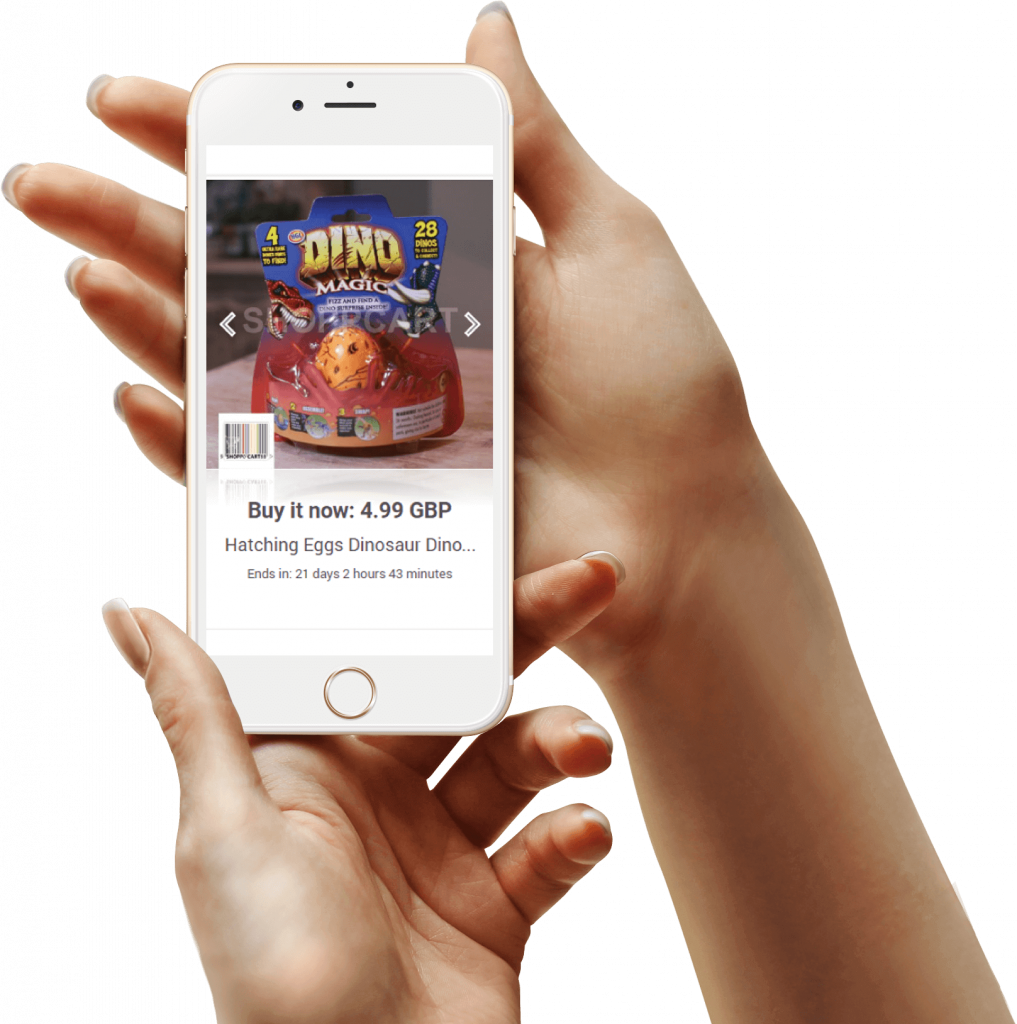
From experience, this is by far the easiest cross-sell gallery I have come across. Simply click the icon near the bottom of the left hand toolbar and move it into position. CrazyLister’s proprietary algorithm does all the work for you, selecting the most relevant items to appear in the cross-sell gallery. It looks great on both mobile and desktop and it’s 100% compliant with eBay’s active content policy.
 |
 |
Now it’s your turn
Make 2018 the year you will make the most out of the great tools available to us eBayers. The marketplace is continually evolving so we need to continually improve our skills as sellers to gain an edge over the competition.
To create an awesom eBay design, take your time to explore all the tools available to you in CrazyLister, especially the tips in this blog post and commit to building ever more professional, high converting eBay templates in 2019!
Need help with creating a professional template for your business? I’m here to help.
Etienne Amion is the founder of Studio8ight (Professional graphic design services for e-commerce and eBay businesses). Based in London, UK.
The only thing I love more than e-commerce is great design.
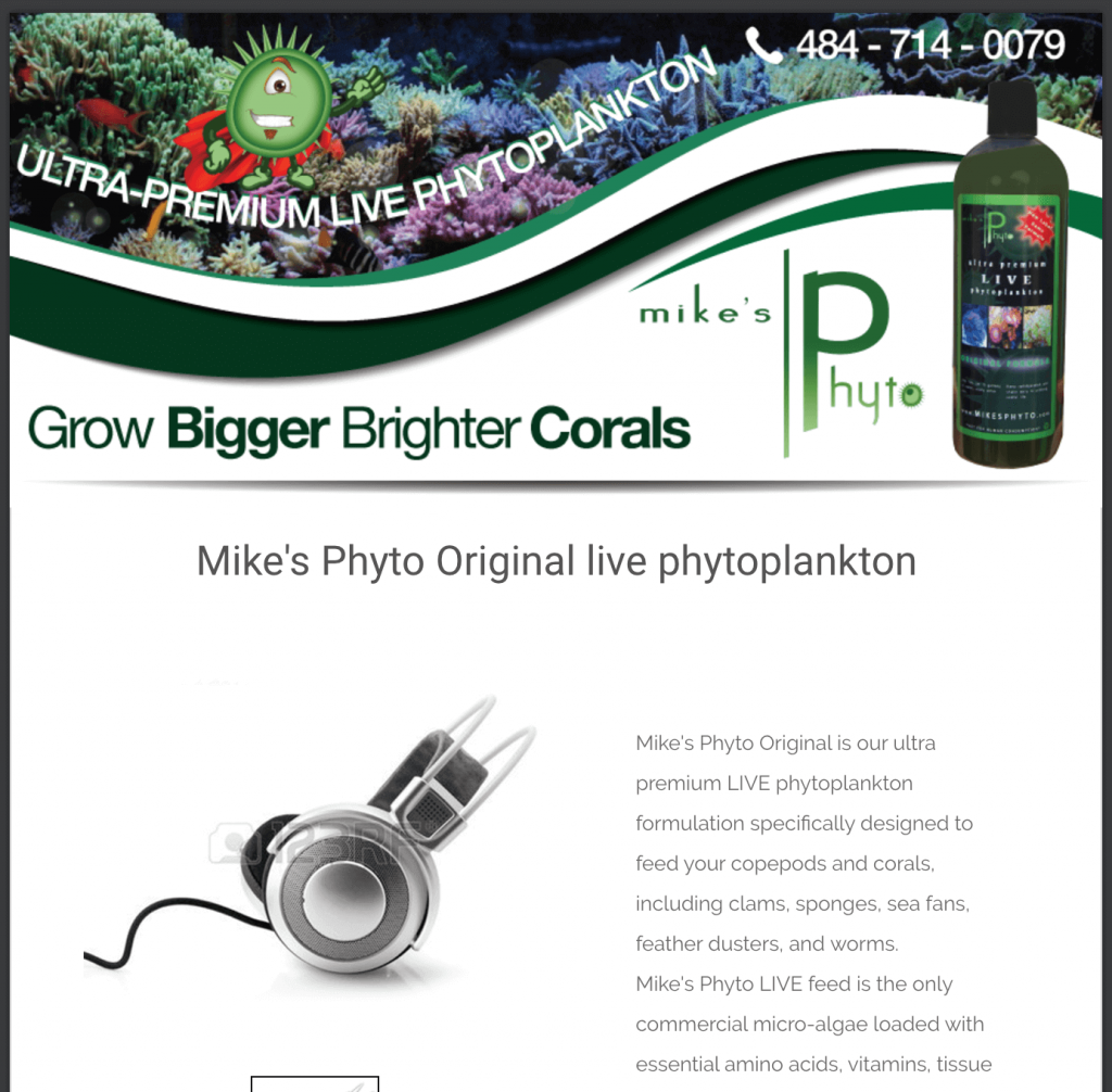
Just as a final note, I thought it might be a source of inspiration to share my favorite template design of the week. Great client with a very unique product and now a professional template design to do his products justice.
Have a great new year!


