Last week I shared everything I learned over the last 10 years about the relevance of an eBay store for you as an eBay seller.
eBay store design has changed significantly over the past few years as eBay moves into a more structured way of showcasing its products.
It has already affected the way individual listings look(with the ban on active content) and it will change the way your eBay store design will look based on the eBay 2018 spring release.
eBay store design post 2018 spring seller update
One of the major updates in the eBay spring update 2018 is regarding the new store design requirements.
eBay released a newly-designed store experience and and enhanced mobile web experience. The new experience will also be active content-free and HTTPS-ready.
When will this update take effect
- May 1, 2018
Who will be affected
If you created a custom design (by using custom pages or html in your store design) you will have to make sure it’s active content and HTTPS compliant.
If you don’t take any action, eBay say they will move you to the new experience at a later date, we encourage to be proactive to avoid compliance issues as was the case for many sellers when the active content ban was introduced.
Why open an eBay store
As I discussed in my previous post, how to start an eBay store, there are a number of good reasons to open an eBay store:
- You can divide your products into categories increasing your product’s accessibility and what I call ‘findability’
- When a customer buys from or browses on your store you are able to ‘cross promote’ meaning you can show other related items for sale and potentially increase the quantity of merchandise said customer will walk away with
- Your merchandise will be more centralized as you will possess a unique link where people can come to view your products and you can post this link on Facebook and other sites in order to increase traffic
- If a customer ‘enters’ your store but then decides he wants to buy something else, you will have an internal search bar where he can look for other items in your store thereby increasing the chance that he will buy from you and not your competition
- And of course you can design and customize your store which will give your items perceived added value meaning you can charge more and give your store a brand identity which will hopefully motivate happy customers to return
The pros and cons of having an eBay store design
The cons include:
- Many custom or template eBay store designs are JavaScript based which is not compatible ever since eBay issued its ban on active content back in June, 2017. Many folks purchased designs or templates and realized that suddenly they were not functioning properly and are hesitant to pay for any designs
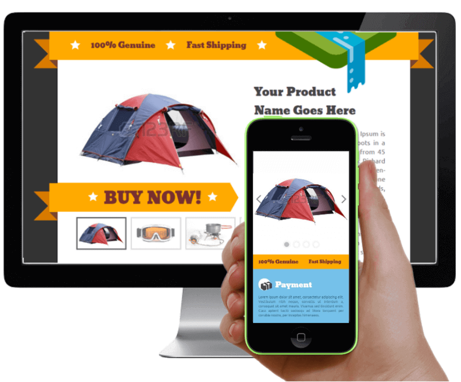
- Mobile commerce is explosive and as such many people are purchasing directly over the phone. A lot of the design magic which was not affected by the active content ban was taking place using HTML in the product description section but often these descriptions are hidden on mobile devices and therefor defeat the purpose
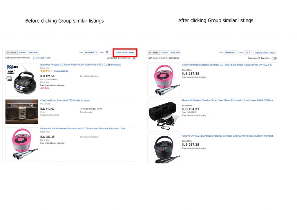
- Similarly eBay rolled out ‘Group Similar Listings’ which allows desktop browsers to search for similar products but displays them in a way where the buyer sees the picture, price and specifications but not the descriptions and sometimes people make a purchase directly from this search page ultimately making designs somewhat obsolete
- And last but not least, you have Cassini, eBay’s search engine which is rumored to discriminate against listings or stores containing HTML though no one can actually prove this
The pros include:
- Having a good store design can often enhance your store’s user or shopper experience and therefor help you sell more merchandise in the short and long term as you will be memorable and shoppers will be enticed to keep coming back for more
- Having a quality looking, well designed eBay store is crucial when it comes to closing a deal. People tend to buy from stores which look and feel professional and which exude an air of expertise. One might compare this experience to going to a crowded disorganized marketplace versus a boutique which specializes in the product you wish to purchase
- And as I mentioned above, good store designs will more often than not highlight the products which are on sale and also do a good job at cross promoting your items thereby inflating your customer’s shopping cart
Three options to choose from when it comes to eBay store design
Once you understand the main pros and cons of having your store designed or using a listing template, one has to understand the he or she has three fundamental options to choose from:
- Do it yourself – or DIY which is a very popular movement in recent years can be the go to option for some people who are amateur sellers with low inventory turnover. Alternatively, sellers who see more negatives than pros in having a store design might opt for this, living in fear of eBay policy updates and Cassini HTML prejudice.
- Use ready made templates – you can typically link these to your eBay account and for a standard monthly fee of anywhere from $10-$100 dollars will buy you access to tens of pre-designed templates or allow you to easily customize your own. This is a relatively cheap and effective option for eBay sellers who want to make an effort but not break the bank. I recommend only choosing a company which allows you to:
- View your listings both on mobile and desktop so that you can make sure that they are optimized and looking good
- A company which is compliant with all eBay policy updates and which automatically makes sure your listings are compliant too
- Custom made designs – Hire a third party company who will provide you with a unique store design and branding mediums such as custom tailored banners and logos. This is great for big time sellers who are willing to invest hundreds or thousands of dollars in order to achieve market dominance and who have clear market goals. Do keep in mind that any little change in eBay policy will cost you additional fees as you purchase designs as is.
How to design your eBay store - a step by step guide
If you chose option one and have decided to go it yourself then I salute your bravery. Here is a step by step guide of how to get started designing your eBay store independently:
Step 1: Once you have officially setup, you want to click the ‘build your store’ link. This is your chance to design an eye catching eBay store which will draw customers in. Think of this as your shop window, you want it to be professional, attractive and draw repeat customers.
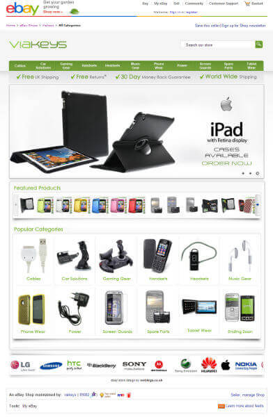
Step 2: First off you want to choose your ‘Billboard image’, this is the image that sits at the top of your page, it should be an inviting image which will catch your future buyer’s eye and can be:
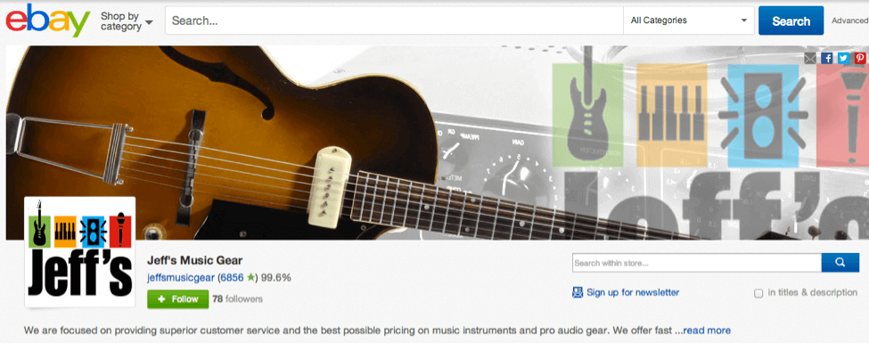
- A photo of the product you are selling. Here Jeff decided to showcase his guitars center stage:
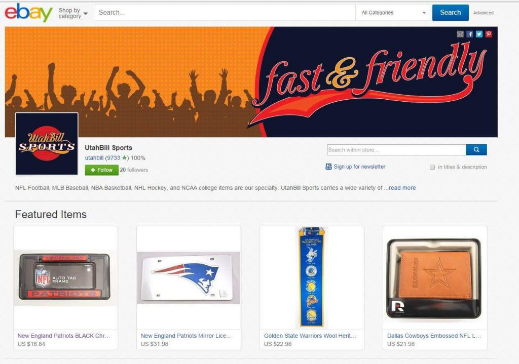
- A ‘digital artwork’ related to your store’s merchandise or concept. Here part of the concept is being ‘friendly’ so they chose to show silhouetted people having fun:
- An image advertising a promotion you are having, for example 70% off all items:

Note: keep in mind that the space provided for your billboard is 1200 pixels in width and 270 pixels in height – try and keep these proportions otherwise a border will appear or your image will be resized automatically and that usually makes it look unprofessional.
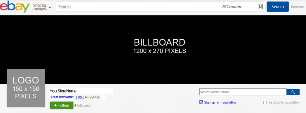
Step 3: Now you want to add your store’s logo and description. Two points to keep in mind here:
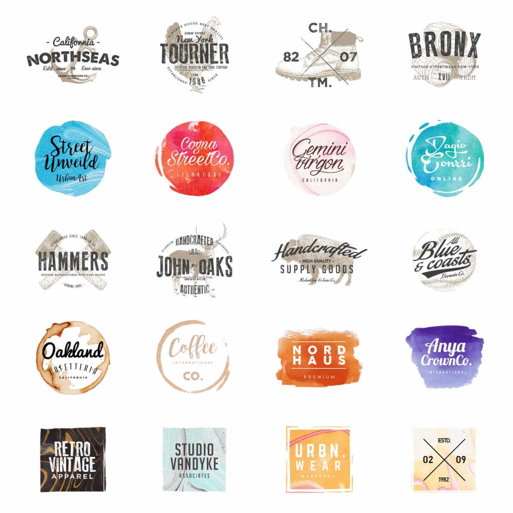
- Having a store whether online or not is all about creating a brand, creating a positive user experience and of course turning shoppers into paying customers. Start building your brand by creating a logo:
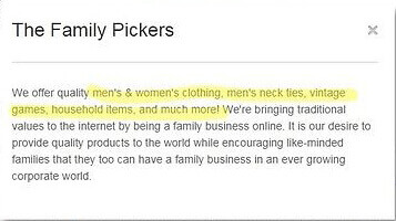
- Additionally you should have a clear description of your store so that your customers are able to connect to your brand on a personal level so let them know what you are selling and why you are selling it.The keywords you use will allow consumers to find your store more easily and are super important. Have a look at this store description which is both personal and hits all relevant keywords:
Step 4: Lastly, I recommend tweaking your eBay store’s theme:
- Click on My eBay> Manage My Store > Display settings
- Click the ‘change to another theme’ link
- Now you can play with the layout and color scheme. Try to make this as user friendly as possible and choose colors which are associated with your product. Red is often associated with food or desire so use red if you are selling food products or erotica. Otherwise I suggest which colors are associated with your product type and try to use them as there is a proven connection between choosing the right color scheme and arousing a positive purchase decision.
- Once you have finished, click ‘save settings’
- In order to edit specific colors, schemes and font size you can always click on ‘edit current theme’
That’s it !- You have successfully completed designing your store independently, congratulations. Now all you need to do is wait for the sell orders to roll in and start filling them.
Optimizing your eBay store
At this point I want to explain the best practices for optimizing your eBay store as laid out by ebay themselves. I will use an image from eBay’s ‘Brand Your Store’ page and give you some tips.
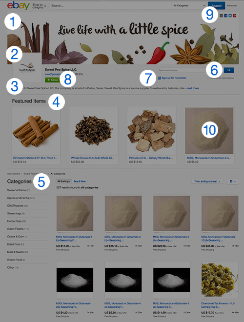
Note that each number I write about relates to a number in this image.
- Main image – otherwise known as a ‘Billboard Image’ is the first thing that visitors will see when visiting your store and can be used to highlight sale or your brand
- Logo – This is where you can import your logo. As I said before a good, representative logo is important for brand identity and distinction
- Description – Here is where you can tell your brand’s story. What makes your products unique and why should someone buy from you ?
- Featured image – This is your opportunity to front line the items you wish to highlight whether its new merchandise or a product you want to offload
- Categories – This feature allows you to organize and group your products as you see fit essentially creating your virtual tailor made floor display
- Store search – As I mentioned above this is a great feature as it can keep buyers in somewhat of a loop, searching within your store for more of your products instead of others
- Newsletter – I discussed this feature in my previous post and your newsletter is a great way to keep in touch with your clientele and update them when new products rollin or when you are having a sale or just to touch base
- Follow – This is a bit like Facebook in except with products. If a a shopper follows you then your iems will appear in their ‘feed’ and you have a higher chance of turning them into repeat customers
- Share – This is great for off eBay promoting and both you and your customer can use this feature to spread the word on social media
- Enlarged photos – Use these to promote specific item especially to mobile shoppers who see these image more prominently

